POSTER
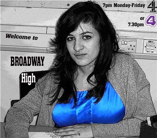
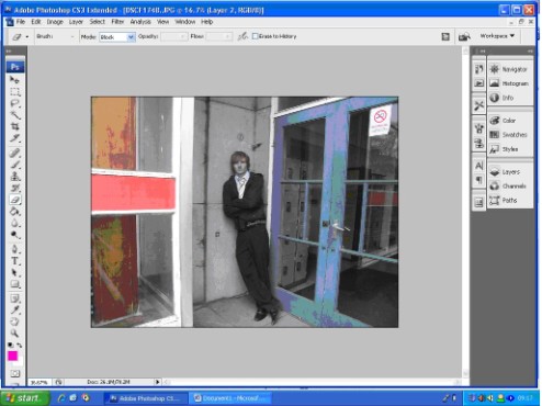
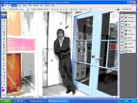
For one of our ancillary tasks we decided to do a poster. When doing our research we didn’t find any posters promoting new soap operas so we weren’t really sure what to include in ours and how to go about it. I thought it would be a good idea to focus on just one characters, perhaps one of the main characters. Therefore we took some photos of the character “Jafooli” and decided to use him as he wasn’t featured much in the trailer but he is a huge important character. We wanted our poster to appear different and fresh whilst looking artistic and intriguing to the eye.
To create this we included a variety of different bright colours and I thought it would be interesting if we put the character in black and white. I really liked this effect as I felt that as well as looking interesting, it conveyed many other underlying messages for example perhaps Jafooli was in black and white because he didn’t feel like he fitted in? Or maybe he was in black and white because he was different and was a character that stood out? Overall I really like our poster, I think we achieved exactly what we wanted to and I believe that the poster looks professional as well as friendly.
CREATING THE POSTER
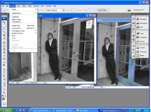  |
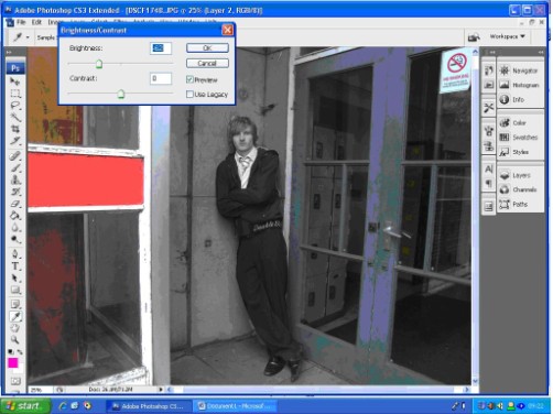
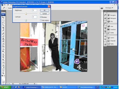
To begin with, we opened up the original images twice, and put one of them into black and white. The black and white one was put under the original image and set as the background. The eraser tool was used as we rubbed out the face and body of our character so that he came out looking black and white whilst his surroundings were still in colour.
|
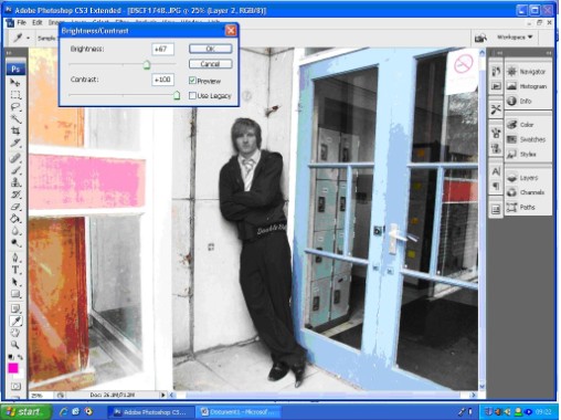
We then changed the contrast of the image, at first it was really dark so we adjusted the brightness levels and increased the contrast levels to sharpen the image and make it stand out more.
|   |
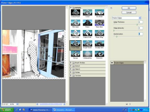
Although the character of Jafooli was in black and white, to make him appear even more different and to make him stand out more we changed the brush strokes used on him to “artistic – poster edges” and then played around with the intensity and posterization. This really helped to sharpen the image; when looking at the poster your eyes immediately focus onto the character.
|   |
 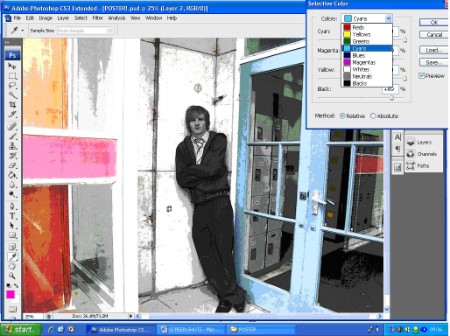 |
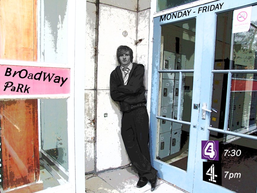
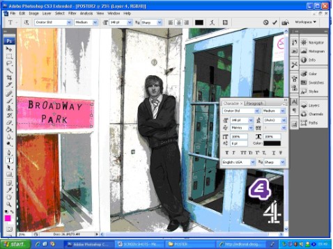
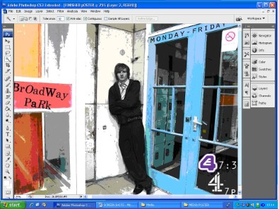
In the image although the setting looks quite dark and dingy, there are two bright colours which really stand out; these are the pink panel and blue doors. The whiteness is also quite a strong colour and stands out a lot. We decided to focus on these three colours and tried to bring them out even more, we did this by selecting a type of colour (for example magenta) and increasing the percentage level of that colour so that any trace of magenta colouring in the photo would appear more vivid and sharper.
|
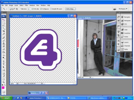
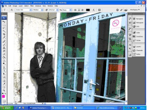
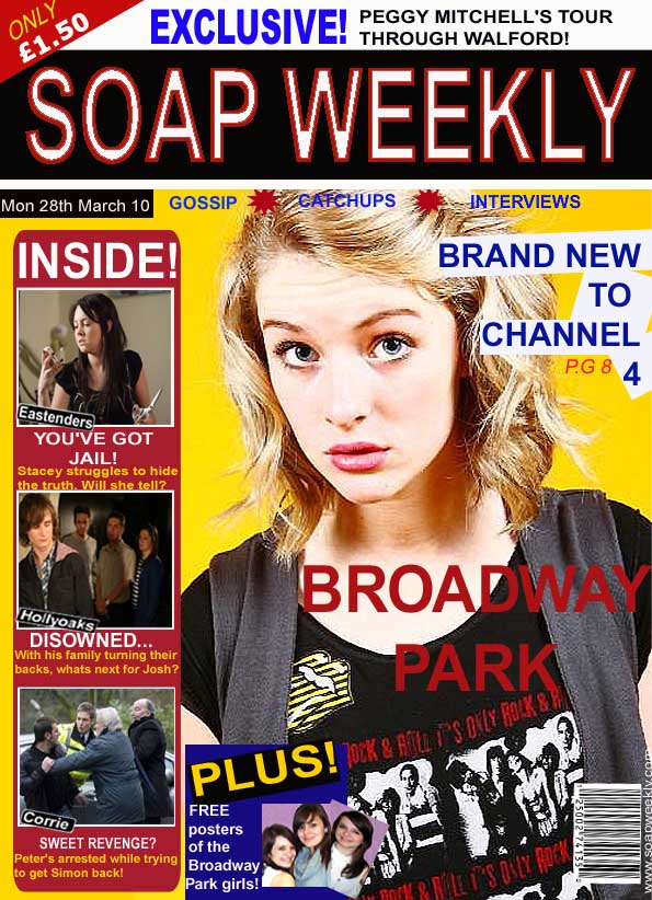
On our poster we wanted to show what channel the show would be on and at what times; there is no point in making materials to promote a new show if you do not mention what channel or time it will be shown because then if people want to watch it then they wont know when or what channel to go to. We had already decided that our show would be aired on channel 4 as from our research we discovered that most people from our target audience ages already watched a lot of programmes on channel 4. We also wanted to give our audience the opportunity to watch next weeks episode a week earlier or to catch up on any episodes they missed on “E4” therefore we promoted this on our poster. We imported two images (the channel 4 and E4 logo) into our poster and then moved them around to a suitable place. The channel 4 logo that we chose was colourful, but we felt it didn’t fit in properly as it didn’t stand out and was quite hard to read, therefore we changed the colouring to all white.
|   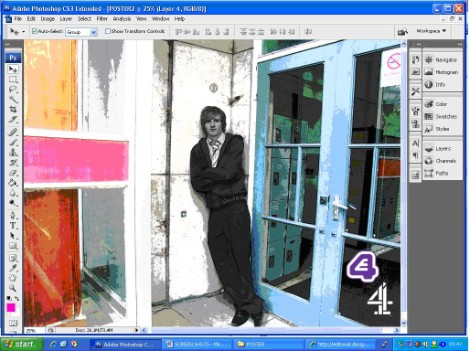 |
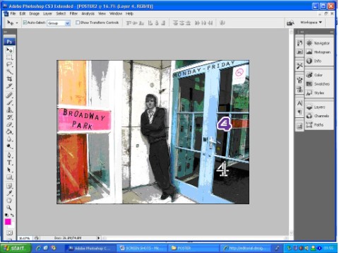
We thought it would be an interesting and creative idea to put the writing against the pink panel; we decided to put the name of our soap opera against the pink panel because it was the biggest amount of space and would catch your attention easily. I put some of the letters in capital letters and left the others in lower case; we also put some of the letters into a different font. We thought this was really effective because we wanted to create a scatty, mis-match effect. We thought this would be appropriate because the majority of our audience would be teenagers and they would be able to relate to the feelings of difference and mis-match. We then added the “MONDAY – FRIDAY” across the top of the door along the blue panel. We felt that we needed to mention that the soap would be aired during these days. We then tried to play around with the positioning of the channel 4 and E4 logos; we thought it might look better if each logo was in a separate window. However this looked too spaced out and we felt that it wasn’t eye-catchy. Therefore we moved them back to their original place.
|    |
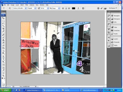   |
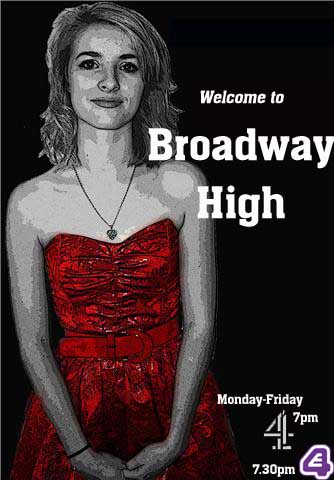
When looking at our poster, we felt that the “Broadway Park” text didn’t look mis-match enough; therefore we changed it even more and made sure that each and every one of the letters was in a different font. This made a massive difference and made the soap opera stand out even more. After checking everything over, we were satisfied and felt that we had done quite a good job. The final thing we did was increase the contrast and then adjust the brightness levels of the poster as whole.
|
COVER OF SOAP OPERA MAGAZINE
When creating our soap opera magazine front cover, it was slightly easier because we were able to look at existing soap opera magazines for guidance (for example the TV weekly guide) and so we knew what sort of things we should include. We discovered that there was always a lot of information available and many images. Therefore we used an image of our main character; Summer whilst including images of characters from existing soaps on the left hand side and images of characters from our soap on the bottom. We also stayed to the convention of having bright colours with lots of words in a big font size. I think that our soap opera magazine front cover looks really good; I think its extremely professional looking, eye catchy and makes you want to pick it up to read.
THE CREATION
When creating the front cover of the magazine, we imported the image of summer first and put her against a yellow background. We thought it would be a good idea to use the colour yellow because it’s one of the brightest colours and would therefore immediately grab reader’s attention. We then put a black panel across the top and wrote “Soap Weekly” in capital letters to make the name stand out. We imported an image of a barcode and put it in the bottom left hand corner; in our first year of A-level media we had to create our own music magazine and when doing our research I remembered that a convention of all magazines was to have a barcode in the bottom hand corner (either right or left hand side) therefore we thought it would be a good idea to add this in as it would make our product appear more professional. In the top left hand corner we also added in the price of our magazine, we decided it should only be “£1.50” because this is relatively cheap for a magazine and would therefore encourage more people to purchase it. Over the image of Summer we added in the text “Broadway Park”; current readers would know that this is a new soap and hopefully new readers would pick up on this fact. We also added in “Brand new to channel 4” above so that every reader would know that our soap was new. On the left hand side we created a vertical red panel and then imported in three images from Eastenders, Hollyoaks and Coronation Street. We put a caption underneath each image in a large white font to create an interesting atmosphere and to intrigue our readers. We then added in a couple lines describing what the actual storylines were. Once we were finished, once again we played around with the contrast and brightness levels to give our product a sharper and brighter finish. |  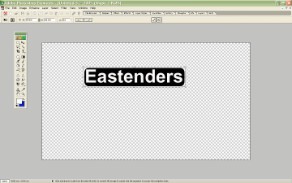 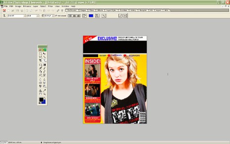 |
OTHER POSTERS
When creating our two ancillary tasks, we also made some other posters that we thought we could also put up. these posters are more minimalistic and we haven’t put up much information on them; we decided to this because we felt it would make our audience more interested as they would want to find out more about the soap. In these posters, instead of writing the name of our soap, we wrote the name of the school that our soap is set in. Although we wanted to introduce the school in our posters we did realise that many people could easily get confused with the name of our soap. A way to resolve this problem would be to put these posters up after the first two episodes of our soap opera had been shown, that way viewers would already know that the school was called Broadway High.